How do we use
color theory to make our eyes pop?
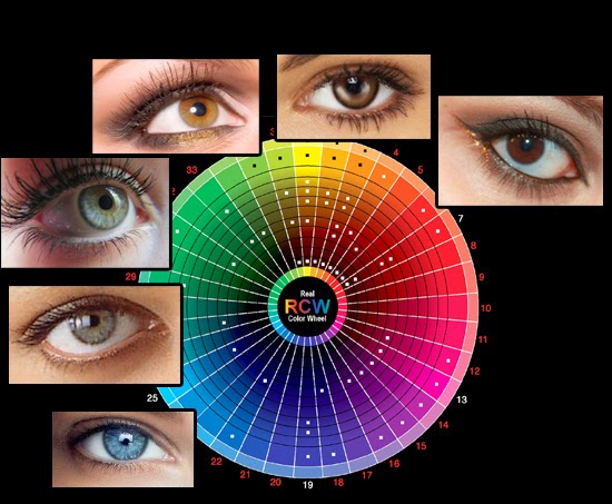
Artists and designers use color wheels to help them with colors, mixing colors with pigments, lights, or optically. The placement of colors on a color wheel don't change-- the red-violet will never wake up suddenly next to green wondering what happened the night before. The main thing to note about color theory is the placement of the colors. The
primary colors (three basic colors that mix to make all other colors) are
red, blue, and yellow. Everything else in between (yellow-green, red-violet, orange, etc.) is created using some mixture of primary colors.
Complimentary colors are the colors that are directly across from each other on the color wheel. Complimentary colors are harmonious-- they make each other "pop" with contrast. For example, green compliments red. This means neighbors of green, such as blue-green or yellow-green, will also compliment red.
What does this mean for, say, eye color?
Maybe you have blue eyes. Maybe they're grey, or green, or brown. Maybe they're hazel. Maybe you like to specify-- "red-brown" versus "golden-brown". Whatever your eye color, there's a complimentary color to it.
If you happen to have
red-brown eyes, and you really want to
emphasize that red color, choosing a compliment to it (green) would make that red stand out. If you wanted that brown color to seem
less red, you'd use a color similar to it, like a warm brown for example, to trick the eye into believing the red-brown color were more of a neutral brown.
For
grey-blue eyes, a navy blue is going to make your eyes seem more grey, while a compliment-- orange, gold or bronze-- will make that blue stand out. Black is going to make that delicate grey-blue feel more pale.
Color theory is an excellent way to find combinations for your eye color to really stand out, and it's a very empowering tool. But it
isn't a rule!
Make-up is an artform without limitations! Experiment, have fun, be confident and express yourself!
For more helpful info about color theory in make-up, check out this article.